Thinking of Decorating? Interior Design expert Toks Aruoture provides some inspiration to help you gain confidence when choosing colours for your home.
Does this ever happen to you?
You’re out and about and you see a very well dressed woman, all eyes are on her. She’s got on a blue and orange floral blouse you would never think of picking up in a shop, she’s wearing a skirt that looks like it was made for the 70s, if it was given to you it would presently be enroute to the charity shop. Add that to the unusual but pretty accessories and she looks drop-dead gorgeous- her confident strut proves that she knows it too’.
I have great admiration for people who confidently throw together the most unlikely colours and yet end up looking like their entire ensemble was handpicked by a fashion icon. Of course it’s an epic fail when you boldly go on to try some colours that no one’s ever done before. It happens in home design and decoration too. Oh, to be so brave as to be able to really use colour, and not admire it from a safe distance.
How do you gain confidence in using colours that work well together? Nature really does offer some brilliant suggestions and we can glean an entire tutorial on combining the right colours from her. I have chosen three distinct palettes to see how they work in real life.
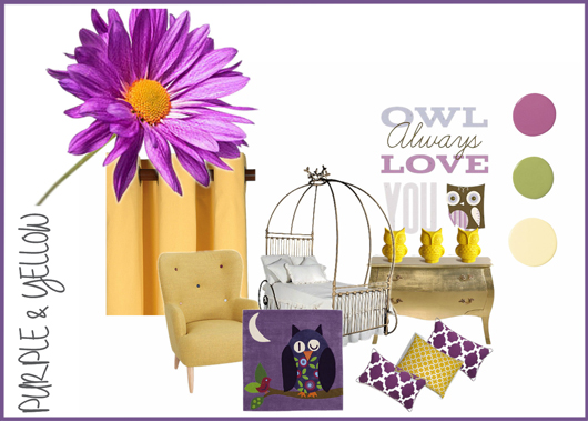
Purple & Yellow

Inspiration from the fifth most popular flower in the world. The Gerbera signifies purity and innocence. There are colours that instantly add the luxe factor, just from their tones. One such colour is rich purple which works great in living rooms, cloakrooms and bedrooms. A complimentary colour like mustard or yellow contrasts dramatically and adds a feeling of happiness to the opulence. Ever walked into a room where you feel you don’t want to upset the rich atmosphere just by your being there? Yellow adds playfulness to the serious tones of a deep purple room.
Aqua & Orange

Beautiful bird alert! The inspiration for this board is drawn from the brightly coloured Kingfisher. Aqua opens up the lines of communication and infuses balance into a room. When teamed with orange, the friendly colour, you end up with a look that’s both striking and relaxing. Geometric prints in either of these colours give a stylish, sophisticated look which is great for common areas like living rooms and dining rooms. The orange makes it a bit too loud for bedrooms while aqua reminds us of the freshness of the sea so this colour scheme works well against a light background like magnolia or white.
Red and Green
When I think of red and green apples I’m reminded of Snow White’s wicked step mother. I have often wondered why Snow White did not think the existence of a half-red, half-green apple was odd. I’m yet to see one in real life, but that colour combination works very well.

Red and green are opposing forces of high energy and serenity. Avoid very dark tones of either as it can result in the room being too dark and the mood, heavy. Use various shades to add different dimensions to it. Red is fiery and intense, while green is restful and relaxing, one is the ying to the other’s yang. Used in equal measure to bring balance and use in equal intensity too.
Remember that there are other factors that contribute to the colour of a room, the amount of natural light the room receives as well as the filtering through of outdoor colours like green from the garden can affect the finished result. Always test paint on different walls and observe at different times of the day. If in doubt, stick with a neutral colour as the base and accessorise with your choice of colour combinations. Happy decorating!