Always wanted to achieve that catalogue look in your home? Interior design expert, Toks Aruoture, shares some trade secrets.

I am yet to meet anyone who doesn’t want to live in a beautifully decorated home that looks like it was photographed exclusively for House Beautiful. After weeks or months of trawling through the magazines, you confidently decide to recreate the look. It isn’t so hard since all the furnishings and decor used are listed – right down to the paint colours.
You enjoy the project but end up with a space that isn’t even remotely close. You wonder how the magazine managed to successfully mislead you. Thankfully achieving that stylish room is easier than you think.
There are a number of reasons why design projects fail. And by it failing I mean you’re not satisfied with the finished project, or you don’t get the buzz or tranquility you anticipated as you stand in your completed room. You may have used the same shade of paint, bought the same curtains and near enough furniture, but instead of ‘light, airy and ocean-inspired’, you seem to have ended up with ‘dark, claustrophobic and comedy-inspired’. Follow these simple guidelines to avoid some of the most common decorating challenges.
Pattern
Patterns create visual excitement. It enriches your space and can be introduced via wallpaper, cushions, curtains or accessories. Your personal style and design preference determines what patterns you are most inspired by. For example nature lovers might be drawn to patterns that replicate outdoor scenery, flora, or elements of water or blue skies.
City slickers will prefer geometric patterns and straight lines. Fluidity is important when using patterns as it draws the eye and can either form a nice, steady flow or an incoherent story. Also choose a pattern you like and then build around it, as opposed to trying to find a piece that goes with a completed room. I always advise that the final colour should be decided last and not first as it is easier to match paint to fabric or decor than vice versa.
“Less is definitely more”
Overkill by having an excessive amount of pattern. You don’t have to have the same pattern on your sofa, walls, rug and curtains just because you love it or it’s available and displayed together in the shop. Remember since pattern stimulates you visually too much of it will not work. Instead leave room for plain areas of solid colour.

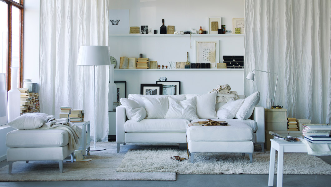
Texture
Texture creates tactile as well as visual intensity and adds an extra layer of style to your room. Again this is introduced via wallpaper, fabric, rugs and decor. Choose natural items like driftwood, sea shells and pebbles for a coastal style. Dried or fresh flowers, a water feature and nature inspired art will provide an outdoor look.
For a country look consider plaid throws and cushions in wool, shaggy rugs (works across all design styles) unpainted wood flooring and furniture. Layered window coverings are another fun way to add texture to your room. You can also trade heavy curtains for airy sheers over blinds to take advantage of the sun and longer summer days. Texture is a great way to liven up a monochrome room, where the same colour is used throughout.
“That fine line between eclectic and cluttered”
Avoid conflicting textures that don’t have a related theme. Even if you are going for an eclectic look, beware of it looking cluttered. Crossing that fine line between eclectic and cluttered will rob you of the peaceful space you may have aimed for.
Colour
Colour plays a major role in the final look of your space. Painting the walls of a room is also the least expensive way to transform it. Warm hues like red, orange and yellow radiate energy and vibrancy and can make a room feel cosy. Cooler shades like blues, greens and purples create a feeling of calm and serenity. They cause the walls to recede which if used in a small room can give the feeling of space.
If you have a small room but still prefer warmer colours, or you don’t want to expend the time and effort in painting the walls, use a neutral shade on the walls and accessorise with warm items or vice versa to make a large space feel cosy.
“Colours in moderation”
As a rule, use warm colours in moderation in small spaces to prevent the room ‘closing in’ on you, while cool colours in large spaces can be broken up with pattern and furniture to avoid a clinical feel.
Dealing with a decorating dilemma? Comment below and I’ll be happy to help.
For design tips and inspiration join Toks on Twitter, Facebook and Pinterest or visit Punkin Patch Interiors